
Typography is crucial in web design, branding, and user experience. Choosing the right fonts isn’t just about aesthetics — it directly influences readability, engagement, conversions, and brand perception. Poor font choices can confuse readers, reduce trust, and even hurt your website’s performance. On the other hand, carefully paired fonts make content approachable, professional, and visually appealing.
Tools like Best Font Pairing Generator, Font Combination Tool, Typography Pair Finder, and Google Font Combination Generator help designers and marketers quickly find fonts that work harmoniously while maintaining readability and accessibility. This guide covers everything from basic principles to advanced strategies, including real-life examples, best practices, and tools for web and branding projects.
Why Typography & Font Pairing Matter for Websites
Every website relies on typography to communicate ideas clearly and beautifully. But typography does much more than just present text:
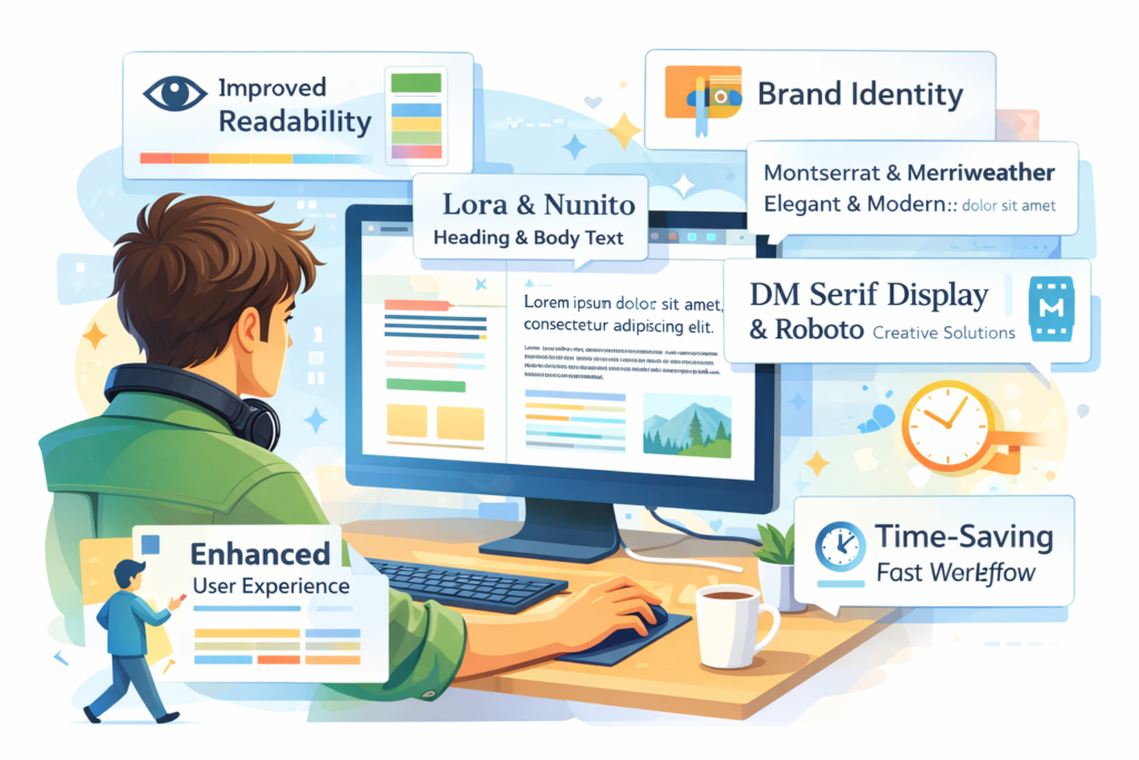
Improves Readability
When fonts are paired thoughtfully — with clear contrast between headings and body text — visitors can scan content quickly and stay engaged longer.
Enhances Visual Hierarchy
Effective font pairing creates a natural path for the reader’s eye, clarifying what’s most important: from headlines and subheads to paragraphs rewriter and calls-to-action.
Boosts Engagement & Conversions
Good typography reduces friction for users. Legible fonts encourage longer reading sessions, clearer messaging, and better interaction with key elements like buttons or forms — ultimately helping conversions.
Strengthens Brand Identity
Fonts convey personality. A modern sans-serif font reflects contemporary simplicity, while a classic serif font suggests tradition and elegance. The right pairings reinforce your brand tone throughout the site.
Supports Accessibility & SEO
Accessible typography — with clear size, spacing, and contrast — ensures all users, including those with visual impairments, can read your content with ease. This improves dwell time and user satisfaction, indirectly benefiting search rankings.
What Is a Google Fonts Pair Finder Tool?
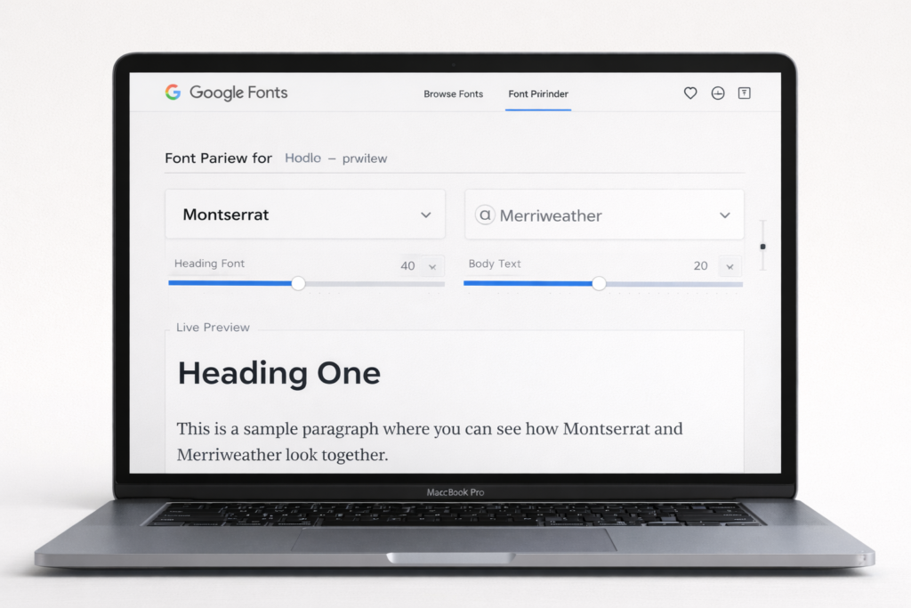
A Google Fonts Pair Finder is an online tool that helps designers and marketers discover compatible font combinations from Google’s free font library. It’s designed to take the guesswork out of pairing, letting you focus on creating typography that’s harmonious, readable, and aligned with your brand.
These tools often include features like:
- Live previews of font combinations
- AI-powered suggestions (like Fontjoy)
- Pair export for easy CSS or embed code
- Curated pairing galleries
Core Principles of Font Pairing
- Contrast and Harmony
Fonts should be distinct yet complementary. Example: Montserrat (geometric sans-serif) with Merriweather (classic serif). - Limit Font Count
Too many fonts look cluttered. Use 2 fonts (headings + body) and optionally one accent font. - Hierarchy
Use size, weight, and style to guide readers naturally from headings to body text. - Readability First
Fonts must be legible across desktop, tablet, and mobile. Avoid decorative fonts for body text. - Brand Personality
Serif fonts feel formal; sans-serifs appear modern and clean. Display fonts are for headings or accents. - Alignment With Purpose
Choose fonts based on project type: blogs, portfolios, landing pages, or e-commerce websites.
Best Font Pairing Tools and Generators
| Tool | Key Features | Ideal For |
| FontPair | Curated Google Font combos, live preview, one-click CSS export | Web projects, blogs |
| FontJoy | AI-powered suggestions, favorite locking, live previews | Designers, marketers |
| Forgedock Font Pair Generator | Style/mood filters, code export (CSS/SCSS/Tailwind) | UI/UX designers, web devs |
| Pair & Compare | Side-by-side comparison, custom content preview | Visual testing before finalization |
| Canva Font Combo & Velosites Typography Picker | Curated combinations, quick visual previews | Beginners, marketers |
Why these tools matter:
- Save time and effort
- Reduce trial-and-error
- Ensure professional, readable typography
- Align with accessibility and modern design standards
Step-by-Step: Using a Font Combination Tool Online

- Define Project Purpose: Blog, portfolio, landing page, or e-commerce site
- Set Style and Mood Filters: Modern, classic, playful, creative, etc.
- Preview With Real Content: Replace placeholder text with actual headlines and paragraphs
- Compare Multiple Options: Evaluate 3–5 combinations for readability and appeal
- Export CSS / Google Fonts Embed Links: Seamlessly implement on websites
- Test Across Devices: Desktop, tablet, and mobile readability
Professional Font Pairings for Designers
- Serif + Sans-Serif: Classic contrast for headings and body text
- Modern Geometric + Neutral: Minimalistic, clean layouts
- Display + Body: Eye-catching headings with readable body text
Tools like Professional Font Pairings for Designers or Font Matching Tool for Websites provide pre-tested solutions, saving time while ensuring professional aesthetics.
Why Free Google Fonts Pairing Tools Are Valuable
- Legal Compliance: Avoid licensing issues
- Cross-Device Compatibility: Widely supported across browsers and devices
- Time Efficiency: Pre-tested combinations reduce trial and error
- Performance Optimization: Load only required weights for faster page speed test
Tools like Free Google Fonts Pairing Tool and Font Pair Generator for Branding make professional typography accessible for beginners, small businesses, and agencies.
Choosing Fonts That Boost Conversions
Typography influences user behavior and conversions. Clear, readable fonts reduce friction; attractive headings highlight key messages. High-performing fonts include:
- Inter
- Open Sans
- Roboto
- Lato
Tips for conversion-friendly typography:
- Use readable body fonts for long content
- Highlight headings with contrasting fonts
- Keep design consistent across pages
- Test font word combiner with A/B experiments
Accessibility and Typography
Accessible typography ensures all users can read content easily:
- Minimum Body Font Size: 16px or larger
- High Contrast: Meets WCAG 2.1 standards
- Line Height & Letter Spacing: Prevent eye strain and improve scanning
- Avoid Decorative Fonts in Body: Save for headings
Accessible fonts improve usability and indirectly enhance SEO through better engagement.
Popular Google Font Pairings for 2026
Here are some timeless and high-performing combinations used by designers this year:
1. Montserrat + Lato
A geometric sans-serif paired with a humanistic sans — clean, modern, and easy to read.
2. Playfair Display + Lora
A classic serif headline paired with a warm, readable serif body — great for editorial or creative sites.
3. Roboto + Open Sans
Neutral and dependable duo — great for tech, business, and UI-heavy layouts.
4. Raleway + Merriweather
Elegant sans paired with a screen-friendly serif — excellent for blogs and storytelling.
5. Inter + Source Sans Pro
Highly readable pairing that scales beautifully for body text and long form articles.
These combinations balance contrast and harmony while remaining flexible for most web contexts.
Conclusion
Typography is more than just style — it’s a powerful tool that shapes readability, brand identity, and user experience. Using a Google Fonts Pair Finder and related tools like Best Font Pairing Generator, Font Combination Tool, and Font Pair Generator for Branding allows designers and marketers to create professional, visually appealing, and accessible font combinations effortlessly.
Key takeaways:
- Enhances readability & hierarchy: Proper font pairing guides users’ attention naturally.
- Strengthens brand identity: Fonts convey personality, trust, and professionalism.
- Boosts engagement & conversions: Clear, attractive typography encourages users to stay longer and take action.
- Supports accessibility: Ensures content is readable for all users, including those with visual impairments.
- Improves SEO indirectly: Better readability and engagement can positively impact search rankings.
Whether you are a blogger, designer, or business owner, investing in thoughtful font pairing saves time, elevates your design, and ensures your project looks polished, professional, and user-mobile friendly.
(FAQ)
What is a Google Fonts Pair Finder?
A Google Fonts Pair Finder is an online tool that helps designers and marketers discover compatible font combinations from the Google Fonts library. It ensures headings, body text, and accents work harmoniously for readability and aesthetic appeal.
What is a font pairing generator?
A font pairing generator, like Best Font Pairing Generator or Typography Font Combo Finder, suggests harmonious font combinations automatically. Some use AI, while others rely on curated design principles.
How many fonts should I use on a website?
Ideally, two fonts are sufficient: one for headings and one for body text. A third accent font can be used sparingly for emphasis or decorative elements.
Can font pairing affect website performance?
Yes. Loading multiple font families or unnecessary font weights can slow down your site. Using only required fonts and weights optimizes performance and UX.
Can typography influence conversions?
Absolutely. Clear headings, readable body fonts, and strategic emphasis on key messages guide users to take action, improving conversions, engagement, and trust.
Are free Google Fonts pairing tools reliable?
Yes. Free tools like Free Google Fonts Pairing Tool or Font Matching Tool for Websites provide tested, open-source fonts optimized for web readability and accessibility.
How do I test if font combinations are effective?
- Preview fonts on real content rather than placeholder text
- Test on desktop, tablet, and mobile for readability
- Check contrast, spacing, and hierarchy
- Conduct A/B testing to see which combination performs better in terms of engagement and conversions
What are common mistakes in font pairing?
- Using too many fonts
- Ignoring typographic hierarchy
- Pairing fonts that clash visually
- Using decorative fonts for body text
- Neglecting mobile readability